Varga House: An Evolving Home of Art and Design

My connection with the Varga House spans many years. You could say that it began in the summer of 1985 when George Varga and I were assigned to be freshman roommates at RISD. George majored in illustration, and I in architecture. Sondae, George's wife, and my wife, Caroline, also attended RISD. We’ve stayed close to the Vargas all these years, settling down and raising our kids in the same town. In 2001 George and Sondae bought a modernist interpretation of a Cape House in Needham and set to work making it their own.

Varga House before the renovation

The original designer, an architect and model builder, envisioned the house as a modern take on the traditional Cape House. In 2007, the Vargas enlisted my help for a renovation. This involved converting unfinished space above the garage into two bedrooms for their daughters and adding a bathroom to an underutilized second-floor deck. The process was fun and gave me insights into their ideas about space, surfaces, color and overall ambiance.

Varga House today - George and sondae have carefully shaped the landscape around the house as well

There are a few unique design features to the original house which are at once wonderfully original, as well as challenging, and even somewhat problematic from a design and maintenance perspective. The skylight on the south side of the length of the ridge requires occasional maintenance, but brings light deep into the second floor spaces, the main stair and the kitchen as well. The stair is a kind of “switch back” trail that pulls you up along the underside of the cape style gable, providing a series of unfolding vistas as you ascend and descend. The “slot” is the area of the house that was most problematic. Designed literally as a cleaving of the main gabled volume, it originally housed a roof deck facing south and a long skylit space facing north. To the east of the slot were the second floor living spaces, and to the west was unfinished space above the garage. This shell space, and the "slot" itself, while initially challenging, became the focus of our design efforts to add bedrooms and a bathroom.

Views of the ridge-length skylight bringing natural light into the upstairs spaces

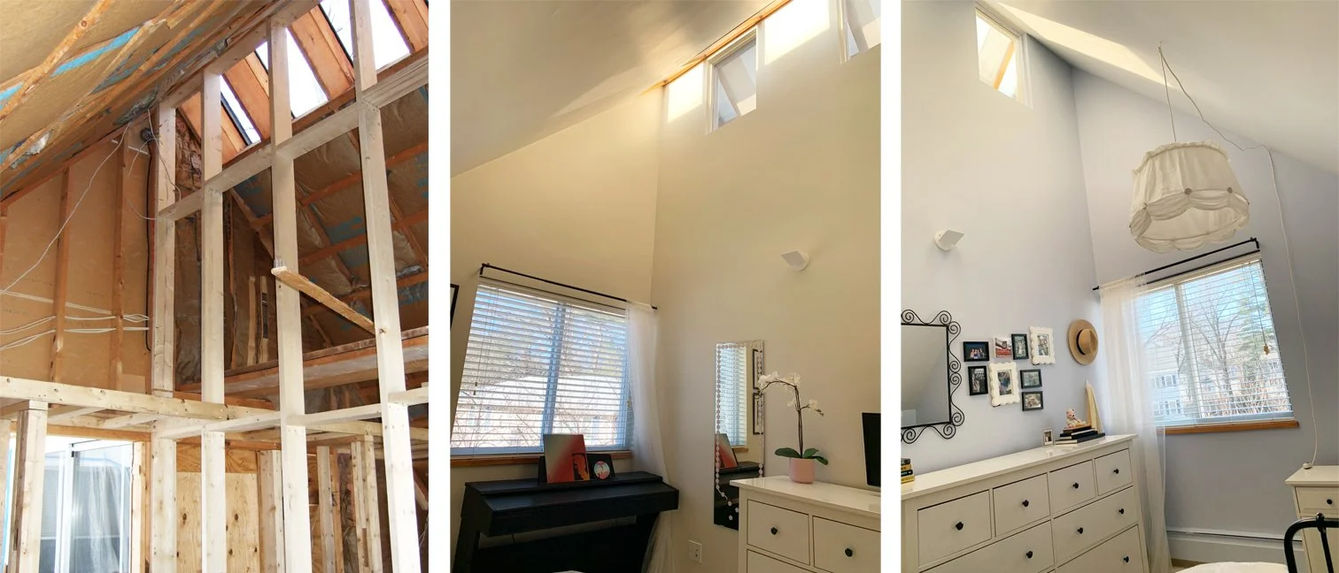
The existing gable end-wall of the shell space was conveniently appointed with two windows on either side of the centerline of the ridge. The space between the windows was the perfect place to add a new stud wall to create two bedrooms, but what to do about the asymmetric skylight at the ridge itself? If the new wall ran all the way up to the ridge, the skylight would bring light into the south facing room but not the north facing room. The solution was to puncture the top of the new wall with small windows corresponding to the spaces between the roof rafters that pierced the skylight cavity, thus allowing borrowed light from the south bedroom into the north bedroom.

During construction and the new bedrooms after construction

The seldom-used deck in the slot area was replaced with a bathroom, and the plexiglass slot roof was upgraded to modern operable skylights, creating a functional home office for George.

“the slot” - a new bathroom and home office replace the roofdeck and storage area

Throughout their home transformation, the Vargas have been avid art collectors, incorporating pieces by me, Caroline, and other artists. This process had a head start of sorts with paintings by Hungarian artists Ezust Gyorgy and Bolgar, gifts from Georges parents. These relatively large works set the stage for an ongoing evolution of the function, look and place of art in their home. Over the years they’ve collected dozens of pieces of mine and Caroline’s work and are often talking about how various corners of their home might evolve and change.

Art throughout the house

There are so many things that I’ve learned by watching the Vargas continue to transform the living spaces, making various architectural modifications and shaping the ambiance of the rooms with careful art and furniture choices and placement. Here are a few things I’ve picked up from them over the years.

Symmetry is not the be all end all. In fact, if you aren’t living in a Palladian villa, its probably easier to achieve an harmonious feel with an asymmetrical approach to room and wall composition. Over the years, they've mastered the art of asymmetry, emphasizing the importance of achieving a dynamic variety without strict symmetry.

asymmetry in grouped pieces

Grouping, grouping, grouping. One of Sondae's talents is skillfully grouping paintings, sculpture, and furniture to create harmony. A large painting meant to convey calm, and help one breath, like my “White Dory” painting in their TV room, may not necessarily be out of place next to a tiny wood block print of bees by Caroline and a modernist textile pattern. A simple building elevation monoprint is transformed next to a collection of sculptural elements. Two small abstracts that suggest small vase-like vessels might be stronger with a vase that echoes the color palette in the room and brings a counterpoint to the rectangular frame of the adjacent abstracts.

by grouping wall art, all pieces have a place

No art is too small for a space and no space is too small for art. Words to live by. Caroline and I occasionally make tiny paintings of say 4” x 4”. Proportionally they are “chunky” and can usually stand up by themselves on a table shelf or desk, acting as both painting and sculpture.

small paintings find a home with sculpture and beloved objects

Where do you want to be? If I have one challenge with the Varga House, it’s that I want to be in every room at the same time. Every corner of it is inviting. Every seat has a purpose. Somehow they manage to pair furniture and art perfectly and it makes me want to grab a book and a coffee and just be.

where do you want to be?…

The Varga’s house will surely continue to evolve, and Caroline and I will continue to make art. Nothing stays the same for long except perhaps our need to find a place to be, if only for a few minutes, in a place that invites us in and holds us a while.

Public Dialogue on the Seam

By John Rufo in collaboration with Form + Place

At Form + Place we have often characterized our design and planning efforts as focusing on the seam between private development and local municipalities. Having worked extensively with both types of entities, we have always felt uniquely positioned to use our design and planning expertise to create rich dialogue and craft a project vision that a community can support. In our recent efforts working for municipalities, a new kind of seam has emerged as an important inflection point in the master planning process. The interface between the municipal agency sponsoring the effort (boards, redevelopment authorities and staff to name a few) and the public citizenry (neighborhood groups, local organizations, business owners, landowners, and individual citizens) represents a key juncture at which trust is established, process is explored, consensus is built and ultimately a vision for the future is articulated.

Community History:

Each community that we work in has a unique history that has led to the point at which we are engaged to create a master plan, update a comprehensive plan, or update an urban renewal plan. The town or city may have historic inequities with roots in redlining and other structural social policies. Each community has typically gone through previous panning efforts with varying degrees of success. Sometimes specific projects built in the community have caused concern for citizens and municipal leaders alike, while others may be hailed as ideal examples of what development should look like and what it should do. Every community has a history of how the citizenry has interacted with the municipal agencies and how the agencies have interacted with each other. One of the critical roles of the design consultant is to facilitate dialogue on both sides of the community seam as well as facilitate intra-agency discussion and decision making.


Redlining Map impacting Winchester North Main Street Corridor


Balancing Big Picture Issues:

Every community wrestles with big picture issues that inform master planning efforts. These issues can often be seen as conflicting. For instance, the hopes and goals surrounding the idea of prosperity, higher property values and an improved built environment, can often be perceived as exacerbating gentrification. A broader range of housing options, including multi-family and affordable housing, can often be villainized as potentially burdening schools as well as transforming the character of a town – senior and empty nester housing perhaps less so. Municipal projects focused on improving the public realm, creating parks or more complete streets, are sometimes seen as competing with other efforts such as school construction, utilities upgrades, or sustainability efforts, when in fact these efforts can work hand in hand to serve a broader swath of the community and incentivize quality development.

Facilitating the Vision – LISTEN & RECORD / SYNTHESIZE & ENVISION

To solidify a master planning idea reflective of both community and municipal agency input, we utilize a two-step process of dialogue that we call LISTEN & RECORD / SYNTHESIZE & ENVISION. Listening & Recording sounds simple, but it involves putting aside any preconceptions of a place, and hearing what people are saying about their community. What are their concerns? What do they like? What do they hope for? Streets, corridors, and districts that we might think, on first observation, are run down or less than inviting, may actually be beloved by locals, while a seemingly thoughtful building in a particular neighborhood might be despised by neighbors and residents as too big or not welcoming. The planning board is often aware of the opinions of the community and is typically sifting through conflicting opinions about the issues and potential solutions. Through a range of facilitation methods – public presentations, community events, zoom presentations, online surveys – we solicit input from community members, steering committees, and municipal agencies alike as a critical data gathering exercise. Listening and recording all the nuanced ideas is crucial in understanding community concerns and developing a potential vision of the future.


Groveland MA – Community Dialogue – soliciting public ideas and feedback in collaboration with Emily Innes of Innes Associates.


Synthesizing & Envisioning is the culmination of a long process of community dialogue. Some aspects of the resulting proposal can be aided by resources such as Complete Street standards which provide valuable and flexible guidelines for developing a street section that accommodates multiple modes of transportation - vehicular, pedestrian, cycling, handicapped mobility, and public transit – across many varied contexts. These guidelines can be “plugged in” and customized for a given context to create livable walkable streets for all, but must also be applied to address the community’s detailed understanding of how their neighborhoods and streets work now and should work in the future.


Winchester North Main Street Corridor


Springfield Chestnut Street Corridor


Similarly building and site design should be applied with an appropriate response to scale and vernacular as well as taking into account future goals for the community. Questions like, should the building meet the sidewalk, or should it be set back? How tall should it be? What materials should it employ? How should vehicular and pedestrian access be sited? These issues can be visually modeled and discussed directly with the community.


Visualizations of buildings and sites responding specifically to scale and vernacular and community input


Putting forth a visual representation that synthesizes the ideas of an entire community - citizens and municipal leaders alike - is a very telling moment in any master planning effort. It is often the case that the first draft creates some “Ah hah” moments as well as honest concerns. One of the things we have learned is that written words describing a future are only partially effective. To solidify an idea about the potential of a community, visualizations of places and buildings is critical for eliciting real response and soliciting real feedback from the community.


Vision for a town green achieved through dialogue with a Redevelopment Authority and initial public input


What’s the Deliverable?

In the end, the resulting deliverable in this process can take on many forms. While the renderings themselves depict a kind of tangible vision for people to hold onto, the mechanism for achieving that vision is often changes to a zoning bylaw and design guidelines. These are meant to incentivize development while giving the community tools and controls to shape development to meet its needs. Similarly, creating a vision for open space and the public realm, helps catalyze the effort to create complete streets or public spaces that reinforce community presence, safety, and roadway equity.

Facilitating dialogue at the seam of community stakeholders and municipal agencies can unite opinions, galvanize ideas, and catalyze real change. Putting forth a vision for people to grasp and ultimately guide the tools to create that change, is an important step in the long arc of community development. Listening + Recording / Synthesizing + Visioning is the process we use at the seam to bring communities together.

Streetscapes Revisited: The Opportunity for Re-Visioning our Cities Remains

By John Rufo + Gillan H. Wang of Form + Place

We published this blog one year ago to consider the Pandemic’s impact on our built environment.  At the time there was no way to imagine how long we would be living with Covid, and as such we felt a sense of urgency to capitalize on some of the innovations that stemmed from needing to temporarily adapt to unforeseeable circumstances, such as dining outdoors and reclaiming open spaces. Today, sadly, we are more aware of the lasting nature of this epidemic. We have updated and republished this blog as a reminder of the continued opportunity to reflect on how we use our streets and public spaces.


In 2020 the NY Times ran an Opinion piece about the benefits of banning individually owned cars in Manhattan by Farhad Manjoo. The article touts the merits of wider sidewalks, more efficient public transit, healthier living, and generally more desirable public spaces that enhance and celebrate the pedestrian experience.  It also features the compelling work done by the folks at the Practice for Architecture and Urbanism (PAU). At Form + Place we continue to think about how the Pandemic is shaping the way we use the spaces surrounding our homes, schools, and places of business. Picnic tables on the town common and pop-up outdoor restaurant seating on sidewalks continue to foster streetscapes that are appealing and more socially inclusive.  While vehicular traffic has certainly returned, it is worth giving some critical thought to the inherent possibilities of a re-imagined streetscape.

 
Pedestrian streets creating a place for dining, shopping and strolling

Pedestrian streets creating a place for dining, shopping and strolling


Already familiar with a handful of places (in Boston and beyond) that have closed off former streets to vehicular traffic, we know the joys of strolling and dining in the resulting bustling urban centers.  Pedestrians brushing up against diners, people jostling with bicyclists, and goods brought out from shops to optimize their visibility and appeal, all contribute to a sense of vitality, which in turn draws crowds.  This is an effective method to continue to employ as we re-vision our cities.  In addition, guideline resources such as Complete Streets codify proven successful design interventions such as parklets and curb extensions.

 
Parklets

Parklets


Curb Extensions

Curb Extensions


Some will argue that parking spaces are a valuable commodity and the lifeblood of already precariously poised retail venues in small downtowns and villages. However when it comes to the ends of blocks where restaurants are often sited and where street crossings are most encouraged, the sheer volume of people and activity suggest that visible curb extensions, textural changes to paving, lighting accents and increased signage are all important parts of traffic calming and establishing pedestrian-focused hierarchy.

By applying this model to Newbury Street in Boston, or a suburban town center like Needham, it isn’t hard to imagine a different reality where a larger portion of the street is dedicated to pedestrians, dining, and other activities, rather than to moving and storing cars. The creative spontaneous response during the COVID crisis where small portions of “streets” are reclaimed for other uses has functioned as a real-time experiment, allowing us to easily imagine our typical street a little differently. Replace the jersey barriers, the traffic cones and temporary galvanized railings with design elements of the same function but better aesthetics, and the street quickly becomes a new kind of enjoyable place to dwell in and share.

 
Photos of Newbury Street and Needham Center

Photos of Newbury Street and Needham Center


Sketches over the above photos showing how easily the streetscape might be improved

Sketches over the above photos showing how easily the streetscape might be improved


Historically, it is only in the last century that the street has come to be dominated by the presence of the privately owned automobile. In ancient and medieval times streets were mostly narrow pathways between buildings, places to route water, goods and sewage, where crosswalks were constructed as literal river crossings.


Typical medieval streets and the ancient roads of Pompeii


The striking juxtaposition of photos of Park Avenue in NYC at the turn of the century and today (as seen in Manjoo’s NY Times article) is a dramatic accounting of good intentions gone awry by changing values.  This is a perfect moment in time to reevaluate our intentions for the built environment of the future.


Evolution of Park Avenue


In many European cities, the “sidewalk” and “roadbed” are often barely distinct from one another, beyond a subtle change in paving. This reinforces an understanding that the street is a dynamic entity that can be re-purposed as needs dictate, and this idea is particularly intriguing.  Could the future of our thoughtfully planned streets allow for the capacity to be literally dynamic?  Imagine a boulevard with limited vehicular traffic (perhaps busses and bikes, as PAU describes in their proposal for NYC) which would allow for restaurants and shops to engage the public more directly, and support increased amenities for the passer-by.

Traditionally the boundary between a street and a market is more implicit than explicit.  An open market can take over a street at certain times of the day with the barkers calling out to pedestrians.  At night shops shutter their doors and restaurants take the stage, extending their indoor atmosphere and allure to the world of the street.


Examples of streets with dynamic edges


At a moment when our commuting patterns have been adjusted, our emphasis on public gathering has been refocused, and we are poised to embrace equity in transportation, it’s important to see the temporary adjustments we’ve made to our streets as a first step toward a better design for our towns and cities. Yes, there will still be cars and stop lights and parking meters, but if a larger portion of the street is dedicated to pedestrians and activities of a more intimate scale, we can humanize our built environment a little more fully, reclaiming some of the real estate lost to our cars and creating a more equitable ownership of the public realm.


Additional sources of inspiration for this post and things we are enjoying reading include:


Updating a Local Retail Icon; The Barn Family Shoe Store Gets New Digs

New Neighborhood / New Look / Same Great Family Business

By John Rufo in collaboration with Form + Place

Do you know someone who grew up in Newton? Or maybe Waltham or Watertown or Brighton? If you ask them, they probably have a story about The Barn Family Shoe Store, known to all as simply, The Barn. That’s where you went to get your shoes. It was big, it was homey and no frills, and in recent decades, as shoe retailing became dominated by stores like DSW, The Barn was a place to go and get advice from people who really knew shoes, welcomed families, and were glad to see you. If you valued your feet and the shoes you wore, it was a must visit kind of place.

 
The Barn in it’s original location

The Barn in it’s original location


The Barn (up until recently) occupied a campus of sorts, spread between two sprawling buildings set back from Washington Street in West Newton. When Form + Place was engaged in 2018 by The Barn to test fit and program a potential space at a new development in Newtonville, the shoe retailer could conservatively hold up to 45,000 pairs of shoes with room to spare in the existing warehouse style buildings. The salesfloor, while quaint and unpretentious, was badly in need of a makeover to catch up with current retailing trends and to provide the kind of shopping environment that customers, especially new customers, look for and expect.

 
Inside the original Barn Family Shoe Store

Inside the original Barn Family Shoe Store


In test fitting The Barn’s operation for a new location, there were two main design problems to solve. First, how to maximize inventory in the new space, and second, how to make it new while keeping it The Barn. The store was also going through a generational change in family ownership. The opportunity, therefore, to evolve the brand through contemporary interior design was identified as a critical aspect of this transition.

A variety of stock areas in the old West Newton location

A variety of stock areas in the old West Newton location

Starting with the back of house, existing stock areas of the old facility, with under-utilized space and outdated stock aisles, would need to make way for a more efficient use of space in the smaller future footprint, while at the same time meeting new building codes and accessibility imperatives.

Sales floor stock, storage and display fixtures in the new store at Trio Newton

Sales floor stock, storage and display fixtures in the new store at Trio Newton

With a smaller footprint for both salesfloor and stockroom areas, making use of the high ceilings in the new space at Trio Newton was critical in maximizing instore inventory. The design called for wall-mounted storage and display fixtures at all perimeter walls, with moveable ladders to access high storage fixtures, slatwall for out-of-box displays, and adjustable low shelves for flexible box storage.

Salesfloor aisles defined with moveable display fixtures, contemporary materials and lighting

Salesfloor aisles defined with moveable display fixtures, contemporary materials and lighting

The overall experience of the new store is warm, calming, and spacious.  The simplified interiors and up-to-date moveable display and stock fixtures give the space a transformable and flexible advantage as well as the opportunity to evolve as shoe retailing continues to change. The materials palette is understated, warm and on-brand, emphasizing the color palette historically part of The Barn’s DNA.

 
Design for cash wrap (left) and the cash wrap in use on Opening Day of The Barn’s new location

Design for cash wrap (left) and the cash wrap in use on Opening Day of The Barn’s new location


The cash wrap, designed to accommodate 3 P.O.S. stations, and individuals with physical challenges, synthesizes the look and feel of the space. Integrating materials that reflect the retailer’s past, while looking forward to the future, the cash wrap is central to the customer experience, and serves as the hub of activity for employees.

Combo+7.jpg

Perhaps the greatest change for The Barn is its new location at Trio Newton, developed by Mark Development and built by Erland Construction in the heart of Newtonville. Large windows allow natural light to flood the new space and provide great curb appeal and views into the store interiors for passing pedestrians. Views to Newtonville’s picturesque sidewalks and Trio’s outdoor courtyard with nearby café seating will be a new experience for customers of The Barn.

 
Combo+8.jpg
 

The Barn officially opened it’s doors with a ribbon cutting on October 19th. Learn more about their story  with this Q&A with Joe Carrigan.

From Initial Concept to Realization: Visioning Tools in the Design Process

By John Rufo in collaboration with Form + Place

During these difficult times with election distractions, COVID challenges and complicated economics, developers and municipalities alike are looking to tee up and frame future development opportunities through zoning, visioning, master planning and feasibility studies. Form + Place, a Newton-based architecture and planning firm, has a unique approach to facilitating these efforts through a design process that utilizes sketching and analytical diagraming to, not only help set the direction for a visioning effort but also, provide a roadmap post-visioning that helps keep projects on track.

 
IMG_1118.JPG
 

In a mixed-use master plan process, there are myriad complexities that tend to be overwhelming for anyone outside of the development team to fully comprehend. The vision that is ultimately put forward therefore - say, through a series of key renderings - tends to be the image that people grasp hold of and refer to again and again when assessing the design. Form + Place defines and articulates that vision through an iterative process of sketching multiple plans and vignettes that allows our clients to visualize the place-making and architectural potential in a project. The ideas in these iterations inform the final vision which can then be understood by a local municipality, and its stakeholders, throughout the entitlement process, or selection process in the case of an RFP. These images, in the form of renderings, elevations or illustrative plans, also serve as our road map to tracking the progress of the design post-visioning as the project is realized.

Salem Matrix 1.jpg

This series of sketches, for example, traces the development of a public space that integrates upper and lower street-level environments. As the final vision moves forward in its development, the ideas of the early iterations act as checks on the final design.

Riverside Station - Newton, MA

On the recently approved Riverside project in Newton, we served as part of the city’s peer review team and authored the city’s design guidelines for the development. Working with the staff, various committees and the developer [Mark Development] through an iterative process, diagramming key urban design objectives such as focal points and view corridors was a critical aspect of breaking down the complex urban qualities of the design into a legible critique and accessible guide for the city council and members of the public. The design guidelines themselves needed to function as both a roadmap for moving the project forward and a template to review the final design for consistency at the building permit stage. In these instances, diagramming is an important tool for communicating design goals and standards during a public process and within the context of a peer review.

 
Pages from 200324_Riverside_Newton_Design_Guidelines_LUC_Presentation_Page_1.jpg
 
 
Pages from 200324_Riverside_Newton_Design_Guidelines_LUC_Presentation_Page_2.jpg
 
 
Diagramming on precedent images to illustrate key guideline objectives such as storefront continuity and façade scale

Diagramming on precedent images to illustrate key guideline objectives such as storefront continuity and façade scale


Springfield Northeast Downtown District – Springfield, MA

In Springfield Massachusetts, Form + Place has been working with the city to develop a master plan for the Northeast Downtown District to put in place an urban framework that will catalyze future development. In a project area of this scale, the complexities of each street and parcel can easily get in the way of seeing the larger objectives of the effort. Diagramming street and open space hierarchies is critical to developing consensus on the focus of the master plan, which will ultimately leverage public funding to upgrade important corridors, open space, and development sites.

 
Setting the scope of the study by diagramming the main commercial and transportation spine in relation to surrounding neighborhoods

Setting the scope of the study by diagramming the main commercial and transportation spine in relation to surrounding neighborhoods


Focusing on the importance of particular design proposals supporting the larger phased master plan objectives

Focusing on the importance of particular design proposals supporting the larger phased master plan objectives


Identifying a network of key green spaces in the context of the larger city fabric

Identifying a network of key green spaces in the context of the larger city fabric


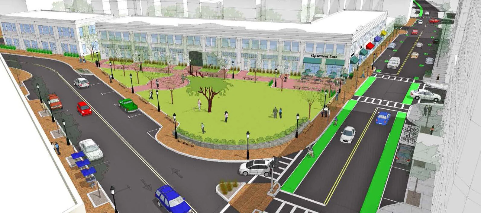
Moving into the more granular aspects of the exercise, specific public realm assets like the Apremont Triangle were re-imagined through an iterative sketch process that addressed issues of open space, traffic flow, building uses and infill opportunities. These sketches were also used as part of a three-dimensional modeling process that allowed people to visualize the proposed changes and imagine what this critical space might be like in the future.

 
Exploring the transformation of public space through the integration of unique landscape qualities and scales

Exploring the transformation of public space through the integration of unique landscape qualities and scales


Exploring more active design strategies that create a variety of types of spaces

Exploring more active design strategies that create a variety of types of spaces


Applying concepts to a 3D model of the space to better understand scale, light, urban edges and vistas

Applying concepts to a 3D model of the space to better understand scale, light, urban edges and vistas


Re-testing the initial concepts in a more fully engineered plan

Re-testing the initial concepts in a more fully engineered plan


Sketching and diagramming never really stop in the course of the design process. As buildings and parks and streets begin to take shape on paper, and the scale of the drawings gets larger and conveys more detail, sketching and diagramming the details serves to constantly clarify intent as well as articulate the finer design details. We often use a metric for judging our own design proposals that poses the following questions:

  • Does the neighborhood or district work when seen in the context of the city?

  • Does the street work when seen in the context of the neighborhood?

  • Does the building work when seen in the context of the street?

If we can keep getting to “yes” as we ask these questions throughout the process, then we know we are in good shape. If we arrive at “no”, then we go back to the drawing board.